

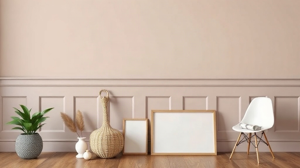
Wainscoting looks beautiful until you have to pick a color, and that is where most of the planning stalls. The best paint colors for wainscoting come down to one question: should the paneling blend with the wall or stand apart from it? Either answer can work, but your ceiling height, trim profile, and room lighting decide which one wins. This guide walks through the strongest color choices, explains why each one earns its place, and folds in a few practical home improvement ideas along the way.
Quick answer: Choose a single color for wainscoting and wall when the room is small or the paneling is subtle, and pick a high-contrast pairing when you want the paneling to read as a deliberate architectural feature. Soft whites, warm grays, muted greens, and deep navies are the most reliable choices because they age well and hide smudges. Always test a sample in the room’s actual light before committing.
Our picks at a glance
The table below compares seven proven color directions against the two things that matter most: contrast level and how forgiving each finish is. Read it as a starting shortlist, then read the entries below for reasons and caveats.
Comparison: contrast level and upkeep
| Color direction | Contrast | Hides scuffs | Works best in |
|---|---|---|---|
| Warm white | Low | Moderate | Small or oddly shaped rooms |
| Soft gray | Medium | Good | Living rooms, hallways |
| Muted sage | Medium | Moderate | Bedrooms, dining rooms |
| Charcoal | High | Good | Studies, dining rooms |
| Navy | High | Good | Light-filled rooms |
| Black trim | High | Moderate | Formal rooms with good light |
| Tonal two-tone | Low | Moderate | Any room with tall ceilings |
Notice a pattern: the more contrast, the more the paneling demands attention. High-contrast pairs also show dust and scuffs more readily on the darker half because contrast magnifies small marks. Low-contrast schemes forgive wear, but they can look flat if the trim profile is shallow.
Why these seven made the shortlist
Each pick is widely available, easy to match in different sheens, and flexible enough to pair with common floor tones. They also cover the full range from quiet to dramatic, so most rooms have an obvious starting point.
1. Warm white for a calm, unified room
A warm white — one with a hint of cream or gray rather than yellow — is the safest starting point. Paint the wainscoting and the wall above it in the same color and the room instantly reads larger and cleaner. This is the right call in small bedrooms, narrow hallways, and rooms with awkward ceiling lines.
Keep the trim in a slightly brighter white than the paneling face for a gentle lift. In low light, pure whites can go gray and cold, so compare two samples against the floor before you buy a gallon. The ceiling deserves the same treatment as the wall in a matching scheme.
2. Soft gray as a flexible middle ground
Gray is the compromise color: it shows enough depth to make the paneling legible, yet stays neutral enough to sit under almost any furniture palette. Mid-tone grays in a satin finish work well in living rooms and stairwells, where walls take regular contact from hands and bags.
Watch the undertone. A gray with a blue cast feels cool and crisp; one with a green or taupe cast feels warmer and pairs better with wood floors. Do not mix undertones within sight of each other — a cool gray panel below a warm gray wall will look like a mistake, not a design choice.
3. Muted sage for a gentle, grounded feel
Sage greens have stayed in favor because they feel natural without shouting. A muted sage on the paneling with a lighter, warmer wall above creates a restful layer that suits bedrooms, dining rooms, and quiet corners. The color also flatters both brass and black hardware.
Choose a sage with noticeable gray in it rather than a bright, grassy green. Bright greens date quickly and clash with warm wood tones more easily. If your room is north-facing and short on light, go one shade lighter than you think you need.
4. Charcoal for depth and definition
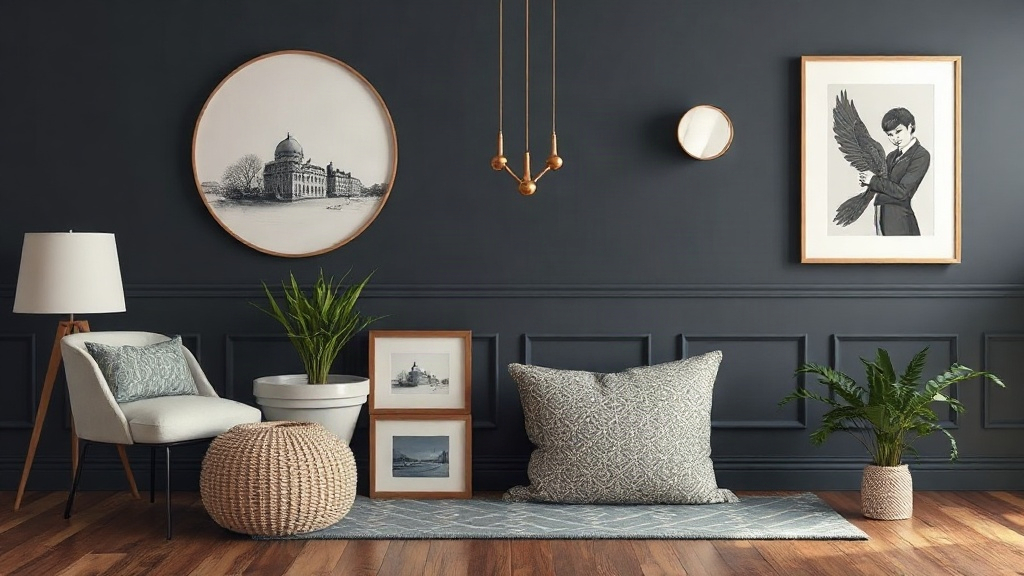
Charcoal delivers the most depth per coat of any neutral. On the wall below a white-painted upper section, it makes paneling look intentional and expensive. This is a strong option for studies, dining rooms, and hallways where you want the architecture to carry the room.
Charcoal soaks up light, so reserve it for rooms with generous daylight or good artificial lighting. It also shows dust on horizontal rails more than lighter tones do. A wipe-down every few weeks keeps it looking sharp.
5. Navy for drama without harshness
Deep navy is the most forgiving dark color because it reads as almost-neutral. Paired with white above, it creates the classic contrast that suits dining rooms, libraries, and entryways. Navy also plays well with warm metals and hides minor marks better than black.
The catch is light. Navy in a dim room can go murky and almost black at night. Test it in the evening with the lamps you actually use before committing to a full wall.
6. Black trim against light walls
Painting the paneling and trim black while keeping the wall pale is a bolder move, and it works when the panel design is crisp and the room has good proportions. This pairing reads as tailored and graphic. It performs best in formal rooms and on simple Shaker-style profiles.
Skip it on busy paneling with heavy ornament — black exaggerates every shadow line, and the result can look heavy. If you want the same effect with less risk, try a very dark gray rather than true black.
7. Tonal two-tone for subtle architecture
Pick two neighboring shades from the same color strip, putting the darker one on the paneling and the lighter one above. The effect adds structure without a hard line. It is an excellent approach for tall rooms, where a single flat color can feel unresolved.
Tonal schemes reward careful sampling. Two shades that look distinct on a fan deck can merge on the wall, especially under warm bulbs. Paint large samples and check them at the same time of day you will use the room most.
How to choose the right option
Start with the room’s proportions, not the paint chip. Ceiling height, panel height, and the amount of natural light should narrow your choices before color preference enters the picture. A well-chosen scheme looks considered; a random one looks unfinished, even with expensive paint.
The 1/3 rule for panel height: if the wainscoting covers roughly a third of the wall, a darker panel color stays proportionate. Floor-to-ceiling paneling can carry nearly any color.
Match color to ceiling height
A dark lower half visually lowers a tall ceiling, which makes a lofty room feel comfortable. In a room with low ceilings, keep the wainscoting and wall closer in tone so the eye travels upward without interruption. This single decision often matters more than the exact shade.
Decide on contrast before color
Low contrast suits small rooms, rentals, and quiet spaces. High contrast suits rooms where you want the paneling to be a feature. Write down which of those you want before you fall in love with a color. The same navy that looks elegant in a formal dining room can feel enclosing in a box bedroom.
Consider sheen and finish
Wainscoting lives where hands, chairs, and shoes land, so a satin or semi-gloss finish earns its place on the paneling. Matte finishes look velvety but scuff quickly in high-contact spots. If the wall takes a modern board and batten accent wall treatment, the same sheen guidance applies to the battens. A washable finish pays for itself in a family home.
Test samples in real light
Paint a sample board and move it around the room at different hours. Check it against the floor, the furniture, and the ceiling. Colors shift with bulb temperature and window direction, and a chip that looks right in the store can fall flat at home. Two days of observation catches most surprises.
Paint two boards instead of one and place them on opposite walls. The comparison reveals how much the direction of light changes each color.
Weigh the long-term cost of a bold choice
Dark, high-contrast schemes are harder to change later because they usually need a primer coat before repainting. Neutral and mid-tone schemes are simpler and cheaper to refresh. If you repaint every few years, plan for that extra step.
FAQ
Can I paint the wainscoting a different color than the wall?
Yes. Two-tone schemes are common and effective, especially on paneling that covers a third of the wall or less. Keep the lighter color on the larger surface so the room does not feel top-heavy. A strong contrast works best when the trim profile is simple.
What is the most popular wainscoting color right now?
Warm whites, soft grays, and muted greens appear most often because they blend with many interior styles. Popularity is a weak guide, though. A color that suits your light and architecture will outperform whatever is trending.
How do I stop dark wainscoting from making a room feel small?
Carry the dark color onto the upper wall or keep the transition low and horizontal. A dark lower band with a bright wall and ceiling above reads as intentional rather than enclosing. Good lighting and a pale ceiling also open up the space.
What finish should I use on painted paneling?
Satin or semi-gloss on the paneling resists marks and wipes clean. Use a flatter finish on the wall above to hide minor imperfections. Matching sheen to location matters more than matching it to color.
How many coats does dark wainscoting need?
Plan on two finish coats over a tinted primer. Dark colors over light surfaces often need a third coat for even coverage, particularly on grooved panels. Light colors over dark require a primer too.
Conclusion: choosing your best paint colors for wainscoting
Pick your contrast level first, then your color — that order prevents most disappointing results. Low-contrast neutrals suit small or quiet rooms, while charcoal, navy, and black trim reward spaces with good light and simple panel profiles. Sample on boards, check the finish against daily wear, and buy a tinted primer to save a coat.
Your next step is simple: tape two sample boards, place them on opposite walls, and watch them for two days before you buy the paint.


